Web · Content
Oroscopo Oggi
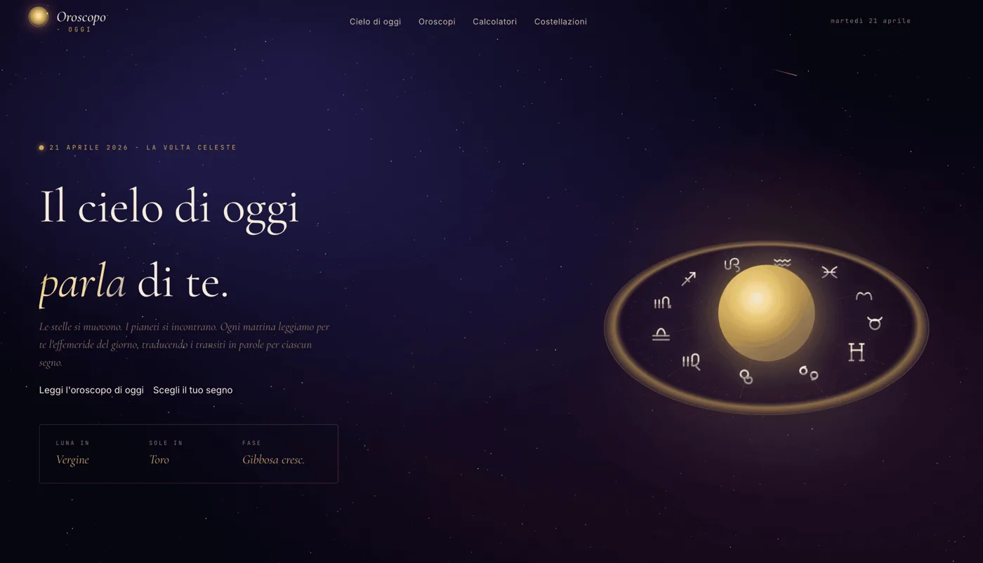
Oroscopo Oggi is an astrology portal that turns the daily horoscope into an immersive experience, beyond the static layouts common in the sector.
oroscopooggi.online
The context
Online astrology attracts exceptionally high search volumes. Each day, millions of people search for their sign, daily horoscope, compatibility, lunar phases or retrogrades. Demand is large and steady throughout the year: there is always a new day to consult.
The paradox is that, despite such broad demand, the offering is almost identical everywhere. Most portals in this sector are stuck with an aesthetic that seems never to have left the early 2000s: static column layouts, advertising banners that overwhelm the content, text arranged in grey walls, and no attention to the reading experience. The implicit message these sites convey is that horoscopes are disposable content, to be consumed quickly between one pop-up and the next.
When Oroscopo Oggi began, this was the starting point: a crowded but visually uniform market, where nobody was really looking after how people felt while reading. And in a sector where the product is, in effect, an emotion and a moment of daily introspection, presentation is more than a detail. It is half the value.
The Challenge
The challenge we posed with Giallo Studio was clear and, at the same time, uncomfortable. How do you build a portal of astrology that stands out in a sea of sites all the same, without falling into the easy temptation to make yet another colorful template with sign icons? And above all: how do you reconcile an ambitious visual experience with the very harsh needs of a project with high organic traffic, where performance, indexing and loading speed are not negotiable?
They are two worlds that usually fight. On the one hand, to emerge you need a strong identity, an immersive experience that makes you want to come back. On the other hand, to intercept people searching on Google you need a solid SEO machine, deep content, lightweight and navigable pages. Many agencies choose one of two tracks and sacrifice the other: either a beautiful site that no one finds, or a site that can be found but is anonymous.
Our aim was to avoid choosing between experience and traffic. We wanted a portal that provides both. Visitors arrive through search, stay because the environment welcomes them, and return because checking the horoscope has become a pleasant daily ritual rather than an irritation to close as quickly as possible.
The idea: an immersive experience
Creative direction came from a simple question: what does it really mean to consult the horoscope? It means looking up. The sky, stars, planets, constellations. Astrology starts there, from observing the cosmos, and almost no industry portal told it visually. We decided to take that root and make it the heart of the experience.
Hence the aesthetic "travel in space": deep blue night as a base, cosmic purple to give density and mystery, bright accents that recall the brightness of the stars. Not a random palette, but a coherent color system that communicates calm, depth and a hint of wonder. The idea was that the moment you open the page you feel transported, not in front of a database of predictions, but inside a small personal planetarium.
Every visual choice was to serve this tale. The background is not a flat color but a living sky. The elements do not stand still in a grid but float, orbit, move with hypnotic slowness. The stated goal was to break the "stacked sections" paradigm and instead build a continuous canvas, an environment where content floats over the cosmos instead of being boxed in.
Development in custom code
To achieve this level of experience, we chose to develop the portal entirely with custom code. This was a deliberate decision, rather than a technical preference for its own sake. The animations and interactions we had in mind — animated star backgrounds, orbiting planets, constellations forming and dissolving, deep parallax across several layers — are simply beyond the reach of generic templates and visual builders. Those tools impose their own limitations, and those limitations are precisely what makes websites in this sector all look alike.
Writing code from scratch means having total control over each pixel and frame. It means being able to decide how a star pulsates, at what rate a planet performs its orbit, how slowly a background level flows relative to the one in front. It means you can sew the experience around the content instead of folding the content to a pre-packaged theme.
There is also a more practical reason, and for a high-traffic project it may be the decisive one: control over performance. A website built on generic templates tends to accumulate extra weight, unnecessary scripts and unused CSS. With custom code, you load only what is needed. In a sector where large numbers of people arrive through organic search, often on mobile and less-than-ideal connections, loading speed depends directly on code quality. An immersive portal that takes five seconds to open loses people before it has even shown itself.
Everything was built completely responsive. The space experience had to work as much on the desktop as on the smartphone, which in the world of horoscope is by far the dominant device. Not a reduced and sacrificed mobile version, but the same idea, carefully adapted to the small screen.
Animations and Interactions
The perceived heart of the project is the animations. The background is an animated night sky in which the stars are not still decoration but living presence: they shine, they light up, they breathe. Above them the planets follow slow and hypnotic orbits, giving the environment a sense of cosmic movement that never tires because it is never hectic.
The constellations are dynamic: they are composed by tracing the lines between the stars and then dissolve, recalling the ancient gesture of recognizing figures in the sky. It's a detail no one has asked for, but it's exactly the kind of touch that turns a site into a memorable experience. People notice it, even when they can't explain why that page makes them feel different.
Deep parallax brings everything together. As people move and scroll, distant stars, intermediate planets and foreground elements shift at different speeds, creating a sense of three-dimensional depth and distance. It is the illusion of space opening in front of you. That gives the portal its immersive quality: visitors feel inside the sky rather than simply looking at its image.
Our rule was that no animation should be gratuitous or distracting. Everything is slow and gentle, supporting calm and wonder. Checking a horoscope is a personal moment, and the interaction needed to accompany that moment rather than disturb it. There is movement, but always elegant movement, never a fairground.
The blog section and content strategy
A beautiful but empty experience does not bring traffic. That's why we built a complete blog section, designed from the beginning as a foundation of editorial strategy and not as an accessory added later. The blog covers the entire universe of astrology in which people actually search: the zodiac signs one by one, the birth charts, the compatibility between signs, the moon phases, the rituals.
This breadth is deliberate. Every topic addresses a real, recurring type of search. Someone searching for “Taurus and Scorpio compatibility” has a different intent from someone searching for “what does the full moon mean?” or “how to read a birth chart”. By covering the entire spectrum with dedicated content, the portal can address all these questions instead of focusing only on daily forecasts.
The blog serves two purposes. It is the project’s SEO engine: in-depth pages target specific long-tail searches that face less competition but together represent significant demand. It also enriches the experience: visitors arriving for a daily horoscope find an ecosystem of related content inviting them to stay and explore. A quick visit can become an ongoing relationship with the portal.
SEO for organic traffic
In a sector where almost all valuable traffic comes from organic search, SEO is part of the architecture rather than a finishing touch. We designed the portal to rank for the searches that matter in astrology — daily horoscopes, zodiac signs and broader topics — building the site structure around how people search.
This meant working on several fronts together. A clear, hierarchical page structure, so every sign, topic and type of content has its own dedicated, optimised space. Content written to actually answer search intent, rather than fill space. And, crucially, performance: the same attention to speed that makes the experience enjoyable is also one of the factors search engines reward. Here, custom code pays off twice, because a lightweight site is both more pleasant to use and stronger in search rankings.
This is what we most wanted to demonstrate as an agency: in a market with exceptionally high search volumes, the winner is not whoever shouts loudest, but whoever combines three things that usually operate separately. A distinctive user experience that makes people stay. In-depth content answering every question. And solid performance making everything fast and discoverable. These are the three pillars, and Oroscopo Oggi was built to rest on all three.
The result
The result is a portal of astrology that does not resemble anyone else in its field. Instead of yet another static, banner-filled site, an immersive experience that turns daily consultation into a small space trip. Night blue, cosmic purple, shining stars, orbiting planets, and constellations that make up: an environment that welcomes instead of attacking.
Underneath the visual surface is a machine designed to last. The custom code guarantees total control over the animations and, at the same time, the lightness needed for a high traffic project. The blog section gives the portal the depth of content it takes to intercept organic demand across the whole spectrum of astrology. The SEO structure places it on the searches that matter.
We prefer to be honest about what this case study demonstrates: we have no interest in promoting inflated traffic figures. What Oroscopo Oggi demonstrates is a method. In a crowded, visually uniform sector, a difference is made by bringing together a distinctive experience, substantive content and rigorous performance — and rejecting templates that flatten everything to the lowest common denominator. This is the practical, no-hype approach we bring to every project at Giallo Studio: form and substance are not in competition; when the work is done well, they are the same thing.
New Project
We bring yours online as well.
Whether it's a site, an automation or an AI agent: tell us the goal and see how to get there.