
Website
Frontaeva
Frontaeva is a contemporary editorial project where design and page rhythm are part of the message.
frontaeva.com
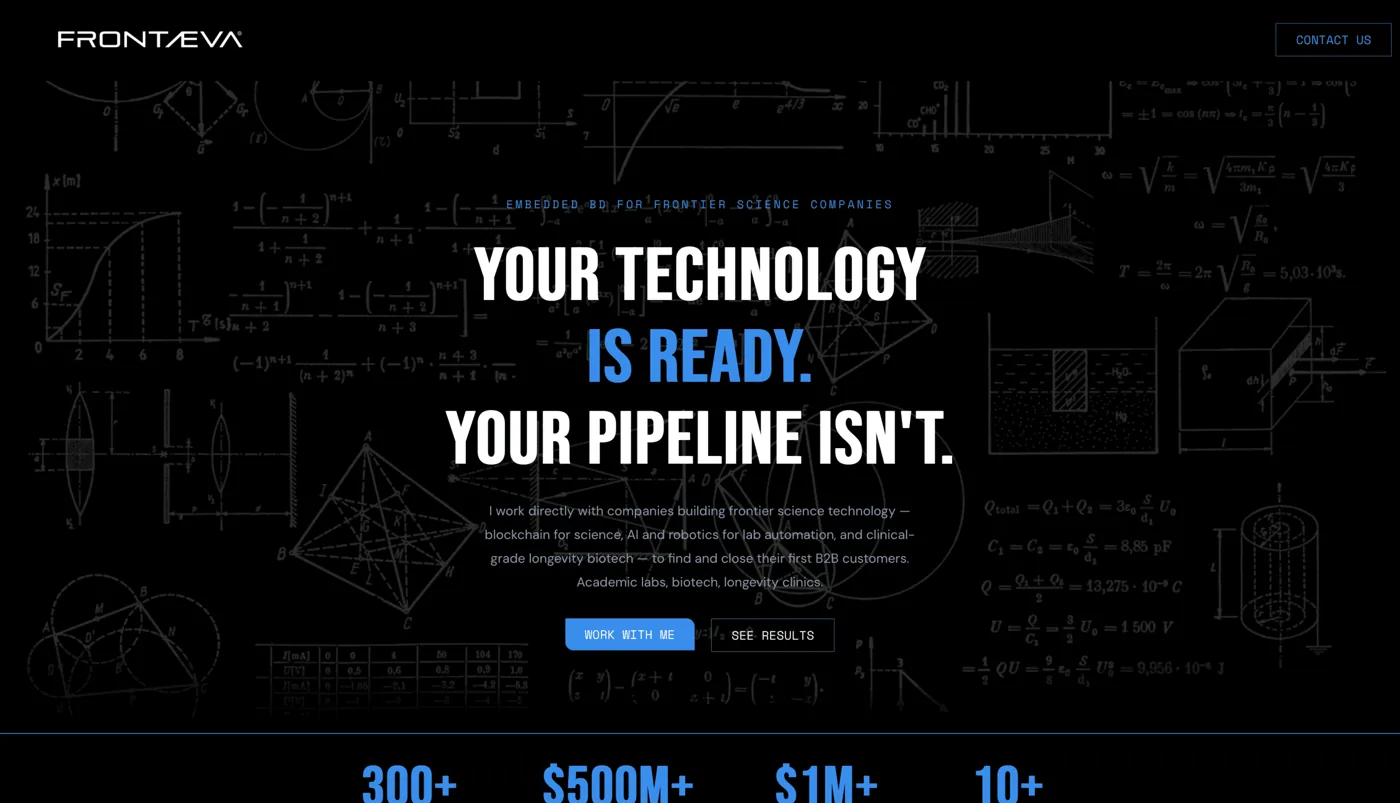
The context
Frontaeva began with a clear ambition: to be a contemporary editorial project, where the website is an active part of the message rather than a neutral container. Instead of a catalogue of features or another showcase following the sector’s conventions, it is a space designed like a carefully edited magazine, where page composition matters as much as the words the pages contain.
When a brand comes with this sensitivity, agency work changes in nature. It is not about filling a predefined structure, but about building a coherent visual language that can convey identity before the visitor even reads a single line. The first question we asked ourselves was not "what sections are needed", but "what feeling must a person have in the first three seconds he arrives". That's where it all started.
An editorial project has a rare quality: it invites people to browse through it, rather than simply consult it. Visitors are not just looking for information; they experience a rhythm, a progression and a tone. This allowed us to treat Frontaeva as a complete design object, where every choice — the weight of a heading, the width of a margin, the pause between one block and the next — has a narrative role. In this kind of work, form is not an embellishment added at the end; it is the very way the content takes on meaning.
The Challenge
The real difficulty in projects like this is not technical. It is standing out. The web is saturated with similar sites: the same templates, blocks stacked one below another, rounded cards with soft shadows, and centred headings with grey subtitles. These are convenient, quick solutions, but anonymous. A brand that wants to communicate character cannot afford to look like everyone else.
Frontaeva's challenge was to bring together two things that are often in tension: a strong, recognisable aesthetic capable of leaving an impression, and clarity, because a beautiful website that people cannot understand has failed. We wanted a bold composition without mere decoration, an eye guided rather than confused, and a reason for every visual choice beyond personal taste.
There is also a question of honesty, which is how we work at Giallo. Standing out does not mean adding effects to impress. It means removing the unnecessary until only what serves a purpose remains, then refining those few things obsessively. A well-made editorial website looks simple precisely because so much work has gone into subtraction. The challenge, ultimately, was to resist the temptation to add more and focus on composing well.
The Art Direction
Art direction is at the heart of the project. This is the stage where we decide not what to say, but which visual voice to say it in. For Frontaeva, we chose a distinct editorial approach: clear hierarchies, asymmetrical compositions where balance is needed without forced symmetry, and deliberate use of empty space as an active element. White space is not what remains after adding the content; it is a design choice that gives every element room and presence.
We treated each page as a magazine spread. Instead of planning one section after another, we considered how the eye enters the composition, where it settles first and how it is guided down the page. That reading path is designed rather than left to chance: the difference between a page that invites reading and one that makes reading a struggle.
The palette and contrasts were calibrated to support this reading without shouting. A brand that wants to look contemporary and cared for does not need saturated colors and aggressive combinations: it needs control. Few choices, applied consistently throughout the site, are worth more than a thousand variations. Visual consistency is what makes a project perceived as professional even to those who could not explain why.
Intentionality guided the work. Every element needed a reason to be on the page. If a detail added neither meaning nor clarity, we removed it. This demanding approach creates a result that feels inevitable, as though it could not have been designed any other way. That distinguishes considered design from a layout that is merely full.
The typography and rhythm of the pages
In an editorial project, typography is not a style applied to text: it is the supporting structure. It is the invisible architecture that keeps everything else standing. For Frontaeva we built a precise typographic scale, with sharp jumps between levels, so that the hierarchy was readable at a glance. A title must be a title, and it must seem so before it is even read.
We used generous contrasts in scale. Large headings occupy space and take centre stage alongside measured, comfortable body text. That contrast creates rhythm: the eye alternates between moments of intensity and moments of quiet, just as in a well-designed printed layout. Rhythm is what makes a page pleasant to move through, and it is built with line spacing, line length and the space between paragraphs.
Readability remained a constant priority. A strong editorial aesthetic must not make reading harder. We controlled text-column widths so lines would not tire the eye, and adjusted line spacing to create breathing room without losing cohesion. People may not consciously notice these details, but they feel them: well-set text is effortless to read, and that ease is a form of elegance.
The rhythm of the pages, finally, was thought of as a progression. The alternation between dense blocks and airy blocks, between moments when the page fills and moments when it empties, guides those who read in a path. It is not a cluster of contents all at the same weight: it is a sequence with accents and pauses. It is this rhythm management that makes the difference between a site that flows distractedly and one that accompanies.
Technical choices and performance
A site curated in aesthetics has no value if it is slow. Performance is not a detail by specialists: it is part of the experience, as much as printing or spaces. A page that is late to load spoils the first impression before the design can even speak. For Frontaeva speed was a requirement, not an optional improvement to be postponed.
We kept the weight of the pages under control, taking care of loading images and assets for the content to arrive quickly and in an orderly manner. An editorial site lives on images and rich compositions, and precisely for this reason it needs discipline: optimizing without sacrificing visual quality, serving what is needed when needed, preventing aesthetics from turning into ballast.
Motion was treated with the same restraint as the rest. No gratuitous animation, no effects chasing spectacle for its own sake. Movement, where present, is subtle and functional: it supports reading, provides continuity between moments and makes transitions fluid without distracting from the content. Restrained motion communicates confidence; excessive motion communicates the opposite. Choosing restraint is itself a stylistic choice.
Behind all this is a simple belief: the technique must serve the design, not complicate it. Technical decisions - how the page is constructed, how the elements are loaded, how animations behave - were made always thinking about the final experience of the visitor. Performance, in this sense, is not a constraint that limits aesthetics: it is what allows it to really exist, on a real person's screen, and not just in the starting mockup.
The mobile experience
Today most people meet a site for the first time from the phone. Treating mobile as a reduced and sacrificed version of the desktop is a mistake you pay for. For an editorial project, where composition matters so much, the challenge is to keep the same character on a screen a few centimeters wide, with only one column available and the thumb as a navigation tool.
We redesigned the compositions for portrait screens, rather than simply shrinking them. Typographic hierarchies were adjusted so headings remained impactful even in limited space, and margins were recalibrated to preserve breathing room. Mobile space is precious, which makes careful handling even more important: removing breathing room to fit in more content is the most common, and most misguided, temptation. A crowded mobile layout is a tiring one.
The reading rhythm was also reconsidered for vertical scrolling. On desktop, the eye takes in the page; on mobile, it discovers the page one piece at a time while scrolling. This guided the sequence of blocks, the pauses between elements and the duration of each moment before a new accent. The aim was for browsing Frontaeva with a thumb to offer the same reading quality as desktop, with its own cadence.
And of course mobile performance weighs even more. Connections are variable, devices less powerful, patience shorter. A fast site on the phone is not a luxury: it is the basic condition for the design to have a chance. For this reason the focus on weight and speed, already central to the desktop, has been carried out with the same seriousness on the mobile experience.
The result and what it communicates
The result is a showcase site that doesn't look like any showcase site. Frontaeva presents itself with the consistency and care of an editorial project, where aesthetics and composition work together to say something even before words: here there is attention, there is taste, there is a precise idea of how things need to be done. For a brand that wants to stand out, this is the most powerful message a site can convey.
What this project shows is that editorial aesthetics are not decoration. The typography used as a structure, the wide spaces as a conscious choice, the measured motion, the curated performance: they are all concrete levers that build perception. A visitor cannot explain why a site communicates solidity to him, but perceives it. And that perception, in the first few seconds, decides whether he will stay or leave.
For us at Giallo, Frontaeva demonstrates how we work when a brand has a strong visual sensibility. We start with meaning rather than effects. We compose pages rather than stack blocks. We remove elements to reveal the essentials, rather than add them to impress. This demanding approach takes time and attention, but it is the only one that leads to a result that looks simple because it has been deeply thought through.
A site designed this carefully communicates one thing clearly: someone behind it cares about the details. In a web full of interchangeable solutions, that care is itself a distinction. Frontaeva is a project where form carries substance, page rhythm is part of the message and every design choice has a reason.
New Project
We bring yours online as well.
Whether it's a site, an automation or an AI agent: tell us the goal and see how to get there.