
Website · Branding
Linguissima
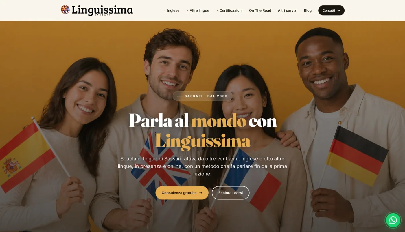
Linguissima is the new brand of an established language training centre. We supported its rebranding and website development, focusing on clarity and conversion.
linguissima.it
The context: an established business makes a fresh start
Linguissima did not start from nothing. It grew from the transformation of a language training centre with a solid history: years of courses delivered, people who had truly learned a language and a method refined through practice. When a business has that depth, the problem is not a lack of substance. It is that the substance is no longer visible. The name, visual identity and digital tools had stood still while the way people find and choose a language school had changed completely.
Someone who wants to learn English today does not ask for advice at a café. They open their phone, search for “English courses” with their city’s name, look at the first results, open two or three websites, assess within thirty seconds whether the school is active, professional and nearby, and make a decision. In this situation, an established business with a dated website and unclear identity starts at a disadvantage to much younger competitors with a far stronger online presence. Not because it is worse. Because it is harder to understand.
That was Linguissima’s starting point: real expertise and results were trapped behind an outdated presentation. Our task was not to invent a school. It was to give an existing school a name, identity and digital home matching the quality of its classroom work.
The challenge: a fresh identity that preserves its history
Rebranding is the most delicate phase when there is a past. You change too much and you risk making the value that people already recognize disappear. You change too little and you remain yet another slightly retouched version of before. The challenge with Linguissima was to find the right point: a clearly new, modern, recognizable identity, which, however, communicated continuity and seriousness, not a gamble.
There was also a very practical challenge. A language centre does not exist only online. It has physical premises, a shopfront, signage, printed materials and a local presence. The new brand had to work well on both a six-inch screen and a sign viewed from the street. A beautiful logo in a file is not enough: it must hold up when printed large, reduced to a tiny social icon or glimpsed while passing the school.
Finally, the offering was broad and needed to be made understandable without oversimplifying it. Linguissima offers courses in English, Spanish, French, German, Italian for foreign learners and other European languages, with an approach focused on real use and conversation rather than grammar for its own sake. This variety is a strength, but poor presentation turns it into confusion. Within a few seconds, visitors needed to understand that their language was available, the method was designed to help them actually speak, and the next step to get started was simple.
We have addressed all of this as a unique path, not as separate jobs. Brand, site and local visibility are three sides of the same problem: getting found, getting understood, getting chosen. Treating them as disconnected projects is the fastest way to get a logo that has nothing to do with the site and a site that no one finds.
The New Brand and Naming
The first step was analysis: the school’s current positioning, its history, how competitors presented themselves and the language people used when searching for courses. That led to the name “Linguissima”. The name does something specific: it makes the subject clear without explanation. The root “lingua” is immediately recognisable; the suffix makes it warm, Italian, a little affectionate, and easy to remember and pronounce. No subtitle is needed to understand that it is a language school, which is exactly what you want when people first find you in a list of search results.
We built a complete visual system around the name. A logo designed to work online and on physical signs: legible at large and small sizes, recognisable even in black and white, and effective on light and dark backgrounds. A warm, contemporary palette moves away from the cold, institutional cliché of traditional schools and communicates a welcoming environment where learning a language is a human experience, rather than an exam.
Consistency was the guiding principle. The same system of colours, fonts and graphic treatment appears identically on the website, printed materials and social media. This is more than an aesthetic indulgence: it ensures that someone who sees a post, then passes the premises and finally opens the website recognises the same school each time. Consistent repetition builds familiarity, and familiarity builds trust. For a business making a fresh start under a new name, that visual continuity keeps its existing audience connected and attracts a new one.
The mobile-first site, fast and direct
The vast majority of people searching for a language course do so on a phone, often on the move and often in the evening after work. That is why Linguissima’s website was designed mobile-first: an experience created for the small screen first and then expanded to desktop, rather than a desktop site shrunk down. On mobile, people must immediately understand what the school offers, where it is and how to request information, without pinching to zoom or searching for the right button.
We placed a strong emphasis on speed. A slow website loses visitors before they read a word, and on mobile networks the gap between fast and slow is even more noticeable. The site is custom-built rather than based on a heavy template packed with unnecessary features: this keeps loading times low and the experience smooth. Every element has a reason to be there; anything that slows the site without adding value was left out.
The calls to action are clear and repeated at the right points: request information or book a free trial lesson. The second is the most important. Someone who is undecided will not enrol in a course on their first click, but may be willing to try a lesson without commitment. Making this step visible, simple and available throughout the browsing journey turns a curious visitor into a real lead. No endless forms, no obstacles: just what is needed to start a conversation.
We also provided a straightforward CMS. The school can independently update offers, events, news and course dates without calling us every time. For a seasonal business with new course cycles, promotions and initiatives, being able to update the site in a few minutes matters. It is the difference between a living, current website and a snapshot that starts ageing on launch day.
The course pages, optimized one by one
The most important choice in the structure of the site was to dedicate to each course its page. English, Spanish, French, German, Italian for foreigners: each language has its own space, not a line within a generic list. This responds to two needs together, one human and one technical, which usually go in the same direction.
On the human side, someone looking for a German course wants to read about the German course, rather than scroll through an indistinct catalogue to find out whether it exists. A dedicated page speaks directly to them: who the course is for, how the conversation- and practical-use-focused method works, and what they can expect. The person feels seen, and someone who feels seen is much closer to taking the next step.
On the technical side, each course page is optimised to reach searches specific to that language. Someone entering a language name and looking for a course finds a page built precisely around that intent, rather than a generic homepage that talks about everything and therefore nothing. Each page becomes an independent entry point: a person can arrive directly on the page for their language, without going through the homepage, and immediately find themselves in the right place, with the trial-lesson call to action within thumb’s reach.
This architecture makes the site scalable. Adding a new language or course format means adding a page that is consistent with the others, not redesigning everything. The facility grows along with the school's offer without losing order.
Local SEO and Google Business Profile
A language school is a local business. People also choose it because it is accessible, nearby and convenient. That is why our SEO work focused on local rankings: being found by people searching for a course by combining the language with their city’s name. Those searches bring real enquiries from people ready to enrol, rather than generic traffic that looks and leaves.
We worked on the website’s content and structure so they would speak the language of those searches honestly and naturally: clear headings, text accurately describing what the school offers and where, and course pages built around real search intent. To support this, we implemented LocalBusiness structured data, code that tells search engines unambiguously what kind of business Linguissima is, where it is located and how to contact it. It is a technical element, but a decisive one for how the school appears in search results and maps.
We also worked on Google Business Profile, the listing that appears when someone searches for the school or similar businesses nearby. For many people, it is their first, and sometimes only, point of contact: they read the address, opening hours and information there, then decide whether to click. An organised listing consistent with the rest of the brand connects what people find on Google with what they later find on the website. No gaps, no surprises: the same school, recognisable everywhere.
The result and what the client retains
By the end of the project, Linguissima was no longer an established business with an ageing image. It had a clear brand and a self-explanatory name, a visual identity consistent from website to signage, and a fast mobile-first site leading to a straightforward next step: request information or book a free trial lesson.
We do not promise figures we cannot guarantee, and we have not invented them here. We prefer to explain what remains in the client’s hands, because that is what really matters over time. They retain a solid identity that can be reused across any future medium without rebuilding it each time. They retain a website the school updates itself, without depending on us for every new announcement. They retain course pages designed to be found, which continue working as entry points even when the school’s managers are focused elsewhere.
Above all, the school retains a foundation built for growth. New languages, courses and local initiatives already have a coherent, organised structure ready to accommodate them. This is the point of how we work at Giallo: rather than deliver a beautiful, finished object that starts ageing immediately, we build a tool that remains useful, that the client controls, and that accompanies the school as it changes.
Linguissima illustrates something we believe in: renewing an established business’s brand and website does not mean erasing its past. It means revealing value that was already there but had become invisible, and presenting it in a way today’s audiences can find, understand and choose. Its classroom expertise is unchanged. Now, simply, people can see it.
New Project
We bring yours online as well.
Whether it's a site, an automation or an AI agent: tell us the goal and see how to get there.