Website
Google Ads Agency
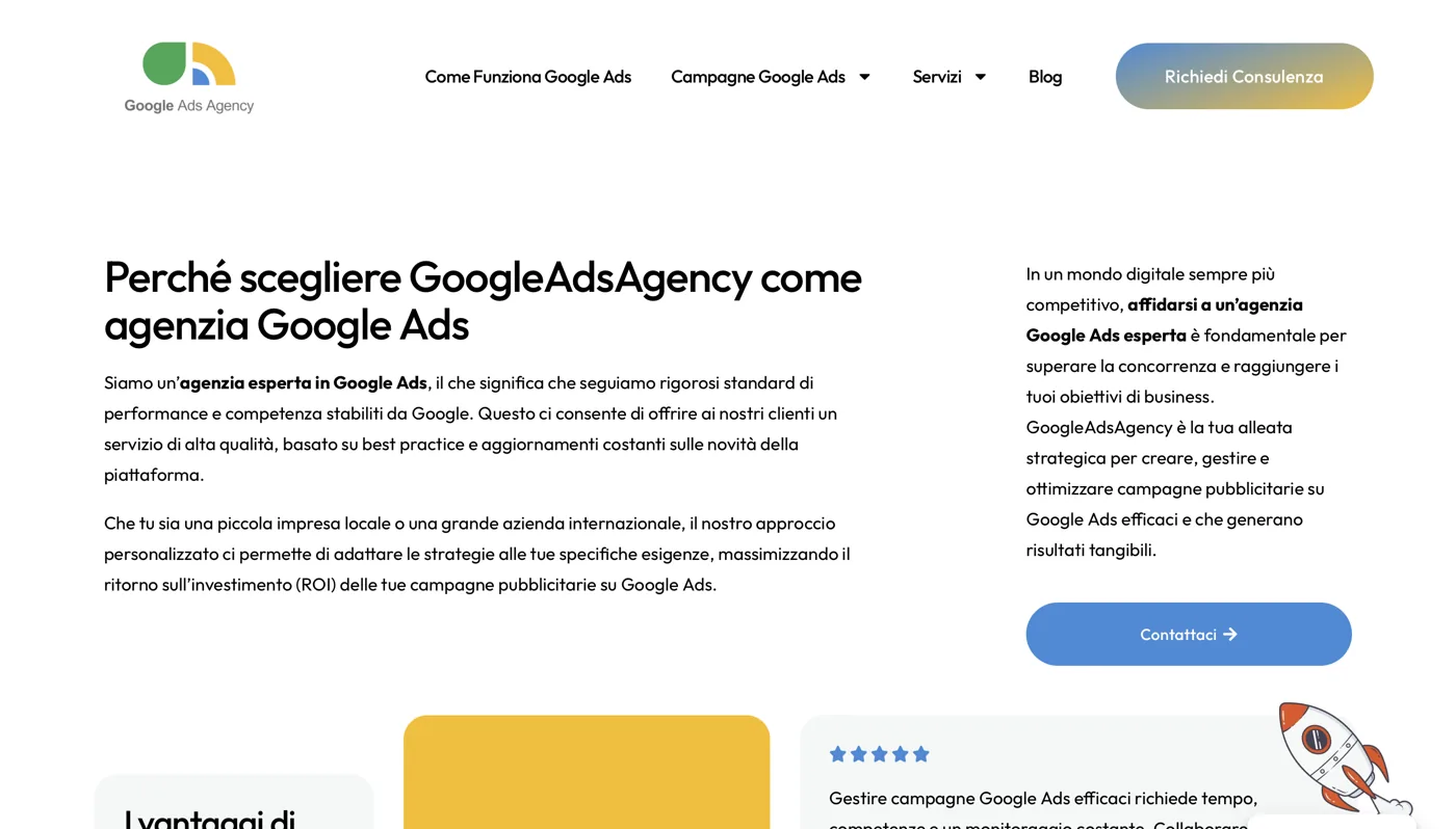
Google Ads Agency specialises in Google Ads campaigns. Its website communicates expertise and prioritises contact enquiries.
googleadsagency.eu
The context
Google Ads Agency specialises in managing Google Ads campaigns. It is not a generalist agency that does “a bit of everything”, but a partner dedicated to one discipline: building, optimising and generating returns from advertising investment on Google’s network. That focus is its strength. It is also why the website could not be a simple business card: it had to be the first practical demonstration of what the agency promises to do for its clients.
When we sat down to think through the project, the starting point was clear. Google Ads Agency’s audience consists of business owners, marketing managers and founders who already understand that online advertising is useful, but are tired of consultants who use complicated language and deliver vague results. They want someone they can trust with their budget. And the first thing they assess, often without realising it, is the agency’s own website. If the site of a business selling performance is slow, confusing or full of clichés, the implicit message is devastating: “if they cannot look after their own house, how will they look after my campaign?”.
This is where the mandate came from: building a conversion-oriented site, with clear messages about results and services, direct paths to contact, and an underlying consistency designed for an audience that is evaluating a partner for advertising. No fuss, no puffed-up promises. Just a working digital environment, exactly as a good campaign should do.
The challenge: demonstrating expertise to people choosing a partner
The advertising industry has a widespread credibility problem. The market is crowded with identical promises: "we triple your customers", "ROI guaranteed", "results in 30 days". Those looking for an agency have heard these phrases a thousand times and have learned to distrust them. The real challenge, therefore, was not to shout louder than the others, but to demonstrate competence without falling into the same clichés.
There is a substantial difference between claiming expertise and making it evident. One is a statement; the other is an experience. Before visitors read a line on Google Ads Agency's site, we wanted them to sense order, control and professional skill. Layout, loading speed and a clearly presented offering communicate expertise before words do.
The other side of the challenge was the clarity of the offer. A Google Ads agency does very technical things: keyword search, campaign structure, bid management, conversion optimization, remarketing, analytics. But the potential client does not want a technical lesson: he wants to understand in ten seconds what the agency does, for who does it and what changes for his business. Translating technical complexity into understandable benefits, without trivializing or confusing, was the most delicate work of the whole project.
The final challenge was supporting the decision. People choosing an advertising partner compare, reflect and ask questions rather than buy on impulse. The site needed to support that considered choice, answer the right concerns at each stage and make the next step, talking to someone, natural and easy.
The Conversion Oriented Architecture
A lead-generation website is designed around the visitor’s journey, rather than starting with aesthetics. Before writing a line of code, we mapped the visitor’s mental journey: they arrive with a problem — my campaigns are not delivering, or I do not know where to start — wonder whether the agency is right for them, look for signs of reliability and, if convinced, want an immediate way to get in touch. The website’s architecture follows exactly that sequence.
The homepage is built to answer in order to the implicit questions of the visitor. At the top, a message that immediately tells you what the agency is about and why it should be of interest. Then the services, explained in a concrete way. Then the elements that build trust. And, distributed all along the way, the points of contact: because the right time to ask to be contacted is not one, it is every time the visitor is convinced.
We kept the structure essential and readable. No decorative section that does not serve to advance the decision. Each block has a specific task: to inform, reassure or invite to action. This discipline is the same that a good account applies to a Google Ads campaign, where every euro spent must have a function. The site, in this sense, is consistent with the working method of the agency.
On the technical level we have given priority to speed and solidity. An agency that sells performance cannot afford a slow site: it would be a visible contradiction. Pages load quickly, the experience is smooth on desktop and mobile, and browsing never loses orientation. The performance of the site is itself part of the message.
Performance-focused messaging
The way an agency talks about itself reveals its way of working. For Google Ads Agency we chose a direct tone, concrete and devoid of useless jargon. Every claim is constructed to be credible before it is appealing. Instead of absolute promises, we have worked on statements that describe the method and the real value of the service: what the agency does, how it does it, what the customer brings home.
We translated technical services into results-focused language without inventing figures. This was a point on which we would not compromise: the website does not display false percentages or inflated success stories. Credibility comes from precisely describing the work, rather than spectacular figures. An experienced prospective client immediately recognises the difference between an empty promise and real expertise, and values the latter.
Each section of text answers a question that the visitor is asking himself at that time. "What exactly are you doing?" find answer in the description of services. "Why should I choose you?" is answered in the elements of differentiation. "What happens if I contact you?" find answer in the clarity of the contact path. This question-answer logic makes reading natural and reduces the friction that leads people to abandon.
We also took care of the consistency of the message from top to bottom. A site that says one thing in the initial section and another lower one confuses and pushes away. Everything, on the other hand, converges towards a single basic idea: here is a specialized agency that knows how to manage Google Ads with method and makes it easy for you to start working on it together. Repeating that same promise, declined in different forms, makes it memorable and reliable.
Social Proof and Trust
Nobody entrusts their advertising budget to a stranger. That is why building trust was a foundation of the project, rather than an embellishment. We worked to communicate reliability through concrete, credible signals, without ever inventing anything. Trust built on false evidence collapses at the first real interaction, and for a performance agency that would be an own goal.
Online trust develops in layers. There is trust built through design: a carefully made, fast, professional website communicates seriousness before its content is read. There is trust built through transparency: clearly explaining what you do and how you work is more reassuring than a thousand adjectives. And there is trust built through consistency: when every part of the site tells the same story, visitors sense reliability.
We prepared the website to accommodate the social proof the agency can build over time, authentically: clients’ voices, references to completed work and evidence of specialist expertise. The structure is ready to highlight them naturally, because the best evidence is real evidence, presented with restraint. A satisfied client, described thoughtfully, is more persuasive than ten self-congratulatory badges.
On the psychological level, trust reduces perceived risk. Those who value a partner advertising are afraid to make mistakes, to throw away money, to rely on the wrong people. Every element of the site works, directly or indirectly, to lower that fear: by showing control, competence and availability. Less fear means more contact, and that's exactly what an agency that lives on customer acquisition needs.
The structure for contact and lead
All the work done so far — architecture, messages, trust — has only one practical goal: to bring the right person into action, that is, to get in touch. That is why the path to contact was designed as a central element, not as a final detail. In a conversion-oriented site, the contact request is not an isolated page somewhere in the menu: it is the natural destination of every read path.
We made contact immediate and straightforward. Wherever visitors are when they decide to act, they see a clear way to request contact. No maze of clicks, no form asking for twenty unnecessary details and no process that drains their enthusiasm. Every obstacle between wanting to make contact and doing so can lose a lead, so we removed those obstacles carefully.
The call to action is consistent and repeated deliberately. Appearing in the right places — after explaining services, after building trust and at the end of the journey — reaches visitors at the precise moment they are most convinced. It does this without ever becoming intrusive: the invitation to act supports rather than pesters them. This balance between persistence and respect distinguishes a website that converts from one that tires people.
We also thought about lead quality, not just quantity. A clear site about the offer and honest about the services works like a natural filter: those who arrive at the contact have already understood what it is and look for exactly that service. This means more useful conversations for the agency and less time lost with off-target requests. Clarity, once again, works in favor of conversion and quality.
The Result: What Changes
What we delivered to Google Ads Agency is not simply a beautiful site to see, but a work tool aligned with the agency's craft. A digital environment that communicates competence through order and speed, that explains services clearly, that builds trust with honesty and that makes contact the easiest thing in the world. Each choice was guided by a principle: the site must be the agency's first successful case, the tangible demonstration that it knows how to do what it promises.
For an agency focused on performance, its own website is the first test of credibility. It is where a potential client decides, often within seconds, whether the conversation is worth continuing. A confusing or slow website closes that conversation before it starts; a clear, fast and consistent website opens it. Google Ads Agency now has a website working in its favour, rather than against it.
The deep sense of the project is the consistency between what the agency does and what the agency shows. An agency that optimizes the conversions of others must have a site optimized for conversion. An agency that sells clarity and results must have a clear, result-oriented site. This consistency is not an aesthetic thing: it is the foundation of the trust on which every commercial relationship in the advertising world is built.
At Giallo, our approach is always the same: no inflated promises, no invented figures, no templates stripped of meaning. Just work built around a real objective — in this case, generating qualified enquiries for a specialist agency — and carried out with the same care we would want for one of our own campaigns. The result is a website that does more than simply exist: every day, it works to bring the agency the right conversations with the right people.
New Project
We bring yours online as well.
Whether it's a site, an automation or an AI agent: tell us the goal and see how to get there.